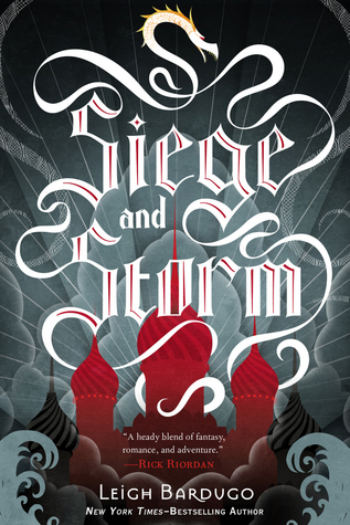
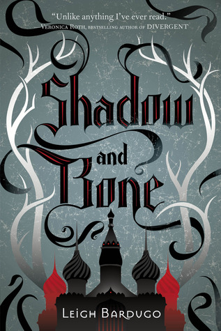
My thoughts: It's too similar to Shadow and Bone's cover. I like the idea of keeping the design consistent, but this doesn't work. If I saw this in the store, I know I would pass it, thinking it was the first in the series because the color scheme is the same. While the Hunger Games series had a consistent appearance of the mockingjay on each cover, the background color changed. Thus, readers recognized that the new book was of the same series, but was able to differentiate that it was new.


No comments:
Post a Comment
I love to hear your thoughts, but please no spam! Thanks for sharing with Lis Les Livres :) Have a lovely day.